
Make sure your new website is mobile friendly (responsive).
.")
These days, it’s important to create a responsive web design approach with any new website. This means the site will adapt to the available screen size of whatever device the user is accessing the site with. If a website is responsive, it’ll be easy (or easier) to read and navigate whether you’re using a desktop computer, a mobile phone, or a tablet (like an iPad).
It’s easy to spot when a website is not mobile friendly: you open the website using your phone or tablet and much of the site, navigation, images or information is unreadable without excessive scrolling. The first glance at a website like this gives you very little to react to…and probably means you leave the site pronto.
People now spend a lot of time using mobile media to view websites.
Mobile digital media time in the US is now at 51% compared to desktop at 42% (sometimes referred to as the biggest shift since the internet began). The implications of these numbers are clear: if you’re not able to reach your audience through mobile search or display, and you’re not providing a satisfactory mobile experience, you will miss out compared to competitors who are.
 Have you ever tried to view a non-responsive website on your mobile phone? You’ll quickly be frustrated…and likely leave the site altogether.
And in case you weren’t convinced you needed a responsive website, Google recently announced algorithm updates that will have a “significant impact” on mobile search results worldwide for mobile searchers. This update improves rankings for sites that provide a mobile-friendly experience to searchers on mobile devices, and, by association, demotes sites that do not. This means that if you’re new site is responsive, it’ll pop up on the search page higher than your competitor who doesn’t have a responsive site.
Unless there is some very compelling reason not to, I always choose a responsive design for my clients when building your site in WordPress.
If working with a designer, make sure you request that your new site be responsive.
Test your existing website in smartphone and tablet emulators on mobiletest.me and see how readable your home page is.
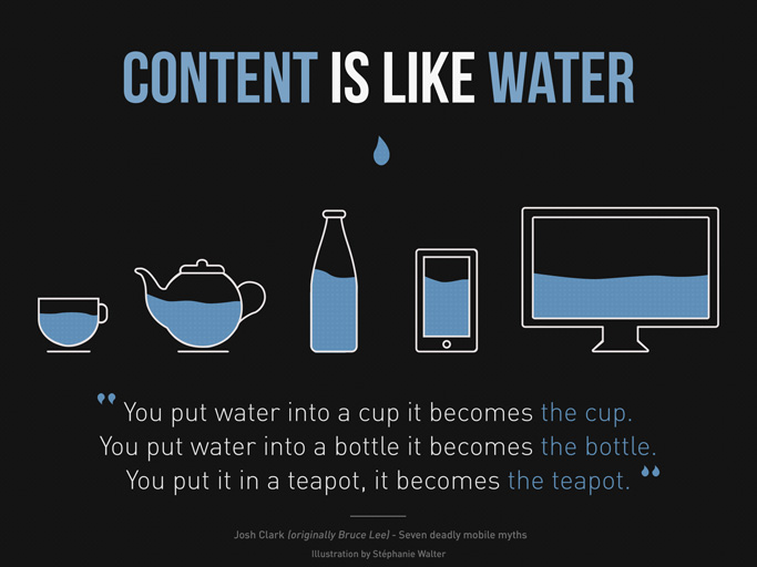
The illustration above, “Content is like water,” demonstrates the idea behind responsive design and was created by web and UX designer Stéphanie Walter.